1
$\begingroup$

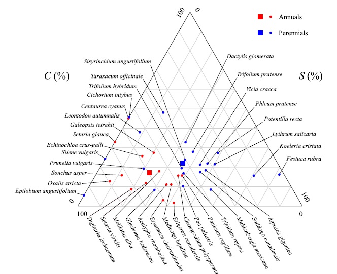
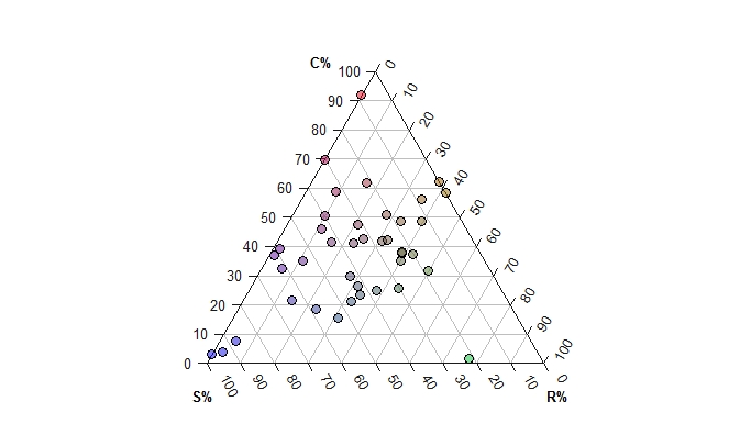
I have plotted a triangular plot,that three dimensions of which represent three herbal strategies. One dimension represents the strategy of C (competitive plant), the second dimension “S” (stress tolerant plants) and the third dimension”R” (ruderal plants), as you can see in the image below, the points on it represent the plant species. Now I am trying to write name of the plant species outside the triangle and connect with the arrow to the corresponding point. How do I do this work? Many thanks in advance as it would help me a lot in my work.

TernaryPlot()
#Plot two stylised plots side by side, and plot data
par(mfrow=c(1, 1), mar=rep(0.3, 4))
TernaryPlot(atip='C%', btip='R%', ctip='S%',
            point='UP', lab.cex=0.8, grid.minor.lines=0,
            grid.lty='solid', col='#FFFFFF', grid.col='GREY', 
            axis.col=rgb(0.1, 0.1, 0.1), ticks.col=rgb(0.1, 0.1, 0.1),
            padding=0.08)
data_points <- list("Bromus dantonia" = c(47,   59, 149),
                    "Calamagrosis psoudo phragmatis" = c(90,    102,    63),
                    "Carex diluta" = c(109, 64, 82),
                    "Carex divisa" = c(96,  99, 59),
                    "Carex pseudocyperus" = c(130,  71, 54),
                    "Carex stenophylla" = c(97, 98, 59),
                    "Catabrosa aquatica" = c(100,   5,  150),
                    "Centaurea iberica" = c(124,    85, 46),
                    "Cirsium hygrophilum" = c(158,  42, 55),
                    "Cladium mariscus" = c(159, 96, 0),
                    "cod2" = c(54,  82, 119),
                    "Cynodon dactylon" = c(121, 54, 80),
                    "Eleocharis palustri" = c(124,  100,    31),
                    "Epilobium parviflorum" = c(67, 80, 107),
                    "Eromopoa persica" = c(83,  15, 157),
                    "Funaria cf.microstoma" = c(8,  0,  247),
                    "Glaux maritime" = c(4, 196,    55),
                    "Hordeum brevisubulatum" = c(76,    70, 109),
                    "Hordeum glaucum" = c(40,   79, 136),
                    "Inula britannica" = c(95,  108,    51),
                    "Juncus articulatus" = c(107,   79, 69),
                    "Blysmus compressus" = c(81,    127,    47),
                    "Juncusinflexus"= c(149,    106,    0),
                    "Medicago polymorpha" = c(60,   86, 109),
                    "Mentha spicata" = c(150,   23, 82),
                    "Ononis spinosa" = c(66,    112,    77),
                    "Phragmites australis" = c(234, 0,  21),
                    "Plantago amplexicaulis" = c(108,   83, 64),
                    "Poa trivialis" = c(90, 28, 138),
                    "Polygonum paronychioides" = c(20,  12, 223),
                    "Potentila reptans" = c(106,    41, 108),
                    "Potentilla anserina" = c(105,  58, 91),
                    "Ranunculus grandiflorus" = c(129,  25, 101),
                    "Schoenus nigricans" = c(143,   91, 21),
                    "Setaria viridis" = c(10,   7,  238),
                    "Sonchus oleraceus" = c(178,    0,  77),
                    "Taraxacum officinale" = c(117, 28, 110),
                    "Trifolium repens" = c(94,  4,  157),
                    "Triglochin martima" = c(63,    96, 95),
                    "Veronica anagallis-aquatica" = c(55,   37, 163)
)
AddToTernary(points, data_points, pch=21, cex=1.2, 
             bg=vapply(data_points, 
                       function (x) rgb(x[1], x[2], x[3], 128, maxColorValue=255),
                       character(1))
)

AddToTernary(text, data_points, names(data_points), cex=0.8, font=1)
enter image description here

enter image description here

$\endgroup$
0

1 Answer 1

1
$\begingroup$

Hmmm I'm not familiar with AddtoTernary function, I can see that you've placed a function within the "AddtoTernary" function. The traditional ggplot2 way of doing this would simply be controlled by the theme

ggtern(data=x,aes(x1,x2,x3)) + 
  geom_point(fill="red",shape=21,size=3) + 
  theme_tern_bw()

This will give an arrow for each axis, but additional code is required for different colours (I'd have to look up my past work).

I think what you might want is a colour key? In this case ggtern will have a "key" function because ggplot2 has one.Here, your colouring is based on species not on a colour gradient as to how far to the corner of a graph you are.

Alternatively you can easily put names besides each point in ggplot2, but again this is traditional style code.

Also you can add different shapes to the graph, which might be useful instead of colours.

Arrows and names together peronsally I've not seen on a ggplot2 graphic and I'd have not idea how to do it.

FYI I don't think we need all the data just a few points fine, although it shows why you prefer arrows - personally I would use colour coding. In "traditional" ggplot2 coding the graphing is built up in layers, so if additional functionality is required it is simply appended to the exisiting command. Thus it is quite easy to make modifications.

$\endgroup$
1
  • $\begingroup$ Hi, Thanks for answering Unfortunately, I was not able to draw the chart with the ggplot2 package.I want to write the species name outside the triangle as shown below and connect it to the points inside the triangle with the arrow.how do I draw this ternaryplot? Thank you, I really appreciate your help. $\endgroup$
    – Sharbanoo
    Commented Aug 1, 2019 at 8:39

Your Answer

By clicking “Post Your Answer”, you agree to our terms of service and acknowledge you have read our privacy policy.

Not the answer you're looking for? Browse other questions tagged or ask your own question.