R, the reproductive number, relates to the average number of (new) people that will get sick (infected) per person that is already sick.
For instance, if $R=2$ and you start with a single infected person, then the next generation will be 2 people, those 2 people will make 4 people sick, those 4 people will make 8 people sick, and so on.
Is R a fixed constant for a disease?
This reproduction number, how many people the disease is passed on to, depends a lot on the circumstances. For instance, how frequent are contacts and how likely is transmission per contact. The probability of transmission per contact will depend on the type of disease (and from that stems those comparisons of different disease), but can also be influenced by measures like reducing frequency and intensity of contacts (social distancing).
The coronavirus spreads in droplets from breath, coughs and sneezes, and will reach other people mostly during close contact (Although there may be events of long-distance spreading if the virus is spread in aerosols, which is claimed to be not the case but it may still exist to a small extend, like with SARS in 2003 explained here and here). So, the reproduction number, R, will likely be influenced by measures like preventing close contact, what they also call social distancing, as well as proper hygiene (washing hands to prevent transmission from virus picked up from fomites).
A clear example is the case of a sexually transmittable disease, where condom use, or not having sex at all, will reduce the spreading of the disease.
Alternatively, is there some variability in R and does that degree of variation affect transmission?
There is a lot of variability in transmission rate.
The spread of the covid-19 virus has likely been accelerated by celebration of New Year's in China and skiing holidays and carnaval in Europe (as well as large scale meetings during soccer matches and church services). (this is why large events are bad)
Also, the disease will at some point satiate the surrounding. Once people have been infected they are likely immune for some while and less likely to be infected again. So once the entire household, classroom, or workplace is infected then new infections will be less likely. (this is why long distance travelling is bad because it brings the virus quickly into untouched area's)
It is wrong to speak about the reproduction number. The reproduction occurs heterogeneously and it is wrong to speak of a single number.
The average reproduction might be 1 or less, but there can still be effectively exponential growth within a sub-population with relatively higher transmission rates.
Especially when this sub-population is strongly connected network on a large scale. (the virus is like hopping from cluster to cluster in a large network, the transmission occurs mostly in dense clusters of the network and some area's remain relatively little affected, this is why Sweden does not need to take though measures, their network is relatively sparse and safe)
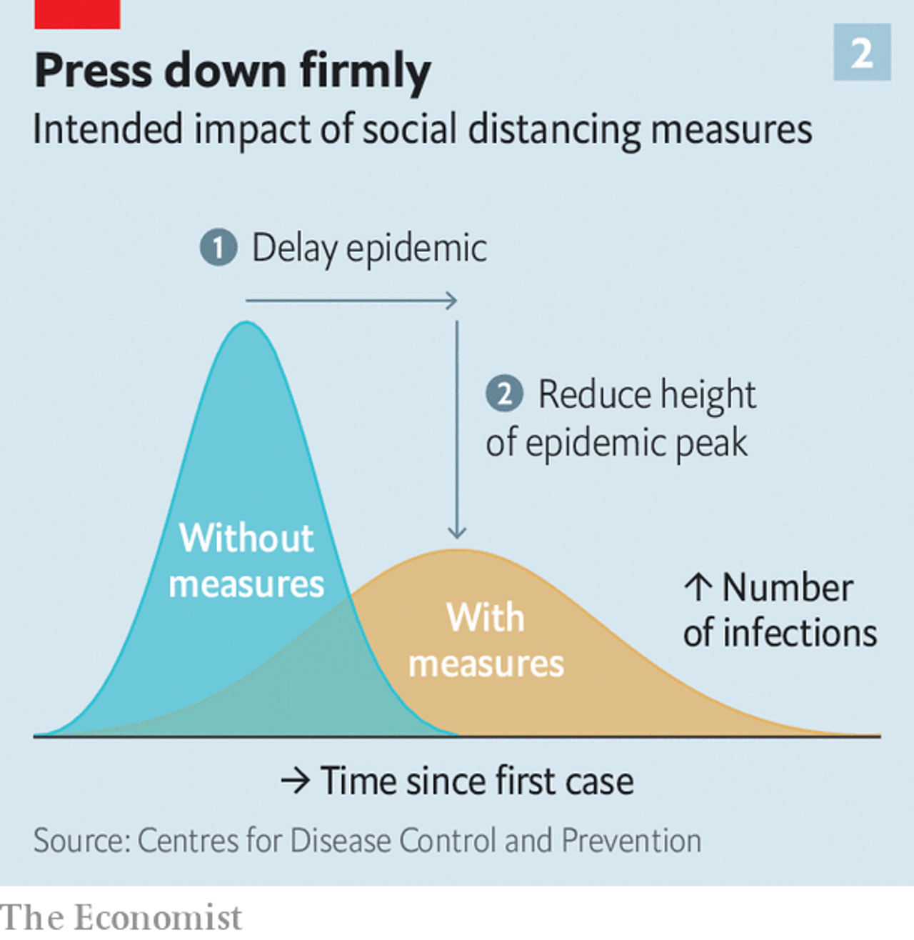
Finally the areas under the two curves is about the same. This means that the number of patients is about the same with or without measures.
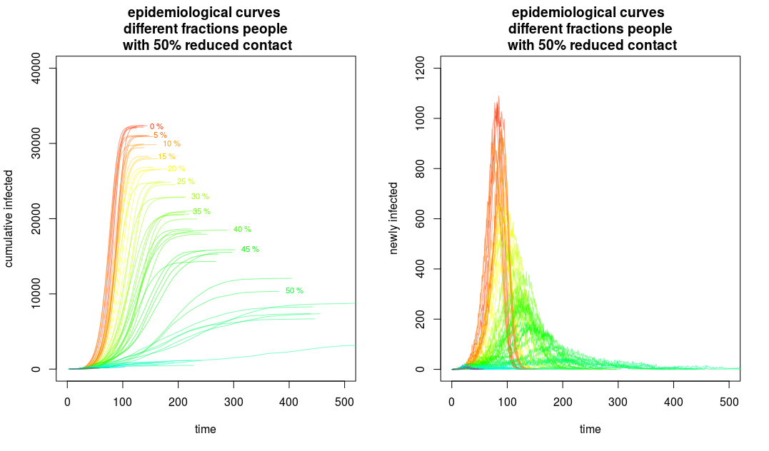
That sketch in the economist article is just a simplistic sketch. The 'flattening the curve' will reduce the rate of growth, but it should also reduce the total number of cases.
An example is the image below from this SE post:
https://stats.stackexchange.com/questions/461319/using-different-nodes-in-a-networked-compartmental-model-sir-for-different-reg
In the image you see the effect of different social distancing measures (more details about it in that post). On the left the cumulative cases are plotted (this relates to the area under the curves) and you see a reduction of the total cases. The curves are not only flattened, but also reduced in volume. (Of course, this does require that the measures are continuously followed for the entire period. That image is an idealistic situation)

Also, it looks to me as though the blue graph goes to zero very quickly
The endemic will eventually halt when a lot of people have already gotten sick (it may also continue for a long time, and become endemic, because the population is not static, and births introduce new people that have not been sick before, also immunity may become lost over time).
The basic reproduction value, often denoted $R_0$, is the number of people that the infection is passed on to when nobody in the surrounding is immune. But if a lot of people have gotten sick already, or when there is a vaccine, then a lot of people are immune, and less new people will acquire the disease. Effectively the reproduction will be less.
When the disease spreads faster, then this point of satiation/immunity will also be reached more quickly. Currently, strategies are being developed to make the disease spread as fast as possible (to get over with it quickly) but not too fast (to not overload the intensive care units and health care system). This may take a long time (there is still a lot of uncertainty about it) and possibly not economically viable.
If you see that the spreading might be over more quickly when we do nothing about it, then it could be better to just let the disease continue without measures, accept the high amount of deaths, and be done with it quickly instead of letting it linger for a long time. (But not many would dare to suggest these things seriously, because of the complicated ethical issues, and a stigmatization of an utilitarian approach to health and preventing deaths. )

