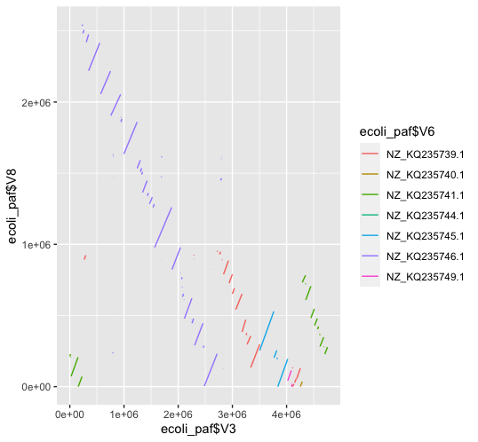
For the issue of just making a dotplot in ggplot2 from a PAF file, it is pretty trivial to do a simple one, though it is necessarily not the most beautiful.
I grabbed 2 random E. coli genomes and mapped them:
% minimap2 ~/Downloads/GCF_000157115.2_Escherichia_sp_3_2_53FAA_V2_genomic.fna.gz ~/Downloads/GCF_000308975.1_ASM30897v2_genomic.fna.gz > 2_ecolis.paf
Then I opened Rstudio and ran the following (which is only slightly modified from what I was first shown by an old colleague, Zev Kronenberg):
ecoli_paf = read.table("~/2_ecolis.paf", sep="\t", fill=T)
ggplot() +
geom_segment(
  data=ecoli_paf, mapping=aes(
    x=ecoli_paf$V3, y=ecoli_paf$V8, xend=ecoli_paf$V4, yend=ecoli_paf$V9, color=ecoli_paf$V6
  )
)
I am far from a ggplot2 expert as you can tell, and there are a few issues here (reverse complement is shown opposite to what you'd expect, linear interpolation of mappings from mapped endpoints), but it makes a somewhat informative dotplot:

I am confident that with minimal fiddling you can make this look a lot better. I will try to revisit and beautify.
