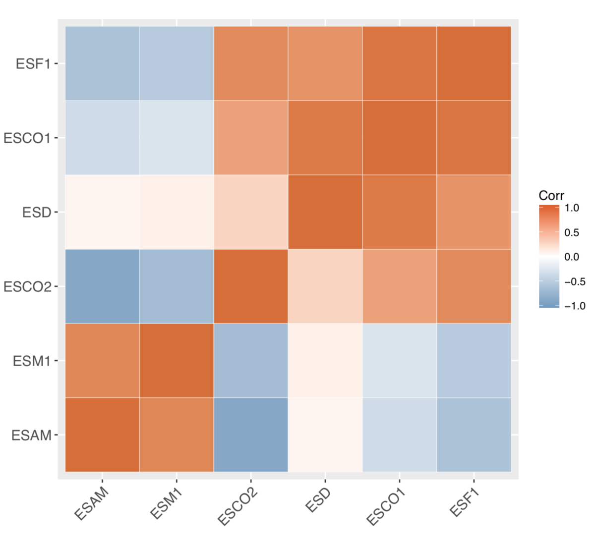
I would like to plot the correlation between two specific genes in my data. I have a matrix with genes in rows and samples in columns, with read counts data. If I want to look at the correlation between 2 genes
1) do I need to convert the counts to some other units?
2) Is normalization needed?
I currently have counts returned by featureCounts:
          Sample1  Sample2  Sample3  Sample4  Sample5

ESAM         803    338       528       841      712
ESCO1        1594   1401      847       392      611
ESCO2         274   778       288       77       204
ESD          6192   3502      2013      1573     1808
ESF1         1356   1497      1011      372      701
ESM1         398    58        114       582      135
I tried this way:
I transposed the above data making genes as columns and sample names as rows. I removed the rows. Lets say the genes as columns is in dataframe "df".
df.mat <- cor(df)
colnames(df.mat) <- NULL
rownames(df.mat) <- NULL
heatmap.2(df.mat, trace="none")
I have an error:
Error in .External.graphics(C_layout, num.rows, num.cols, mat, as.integer(num.figures),  :
  invalid graphics state
I want to look at the correlation between ESCO1 and ESCO2. Can anyone tell me how to do that and plot with a small example.
