2
$\begingroup$

I am using Seurat v2 for professional reasons (I am aware of the availablity of Seurat v3). I am clustering and analysing single cell RNA seq data. How do I add a coloured annotation bar to the heatmap generated by the DoHeatmap function from Seurat v2? I want to be able to demarcate my cluster numbers on the heatmap over a coloured annotation bar. I want to have the an image like this:
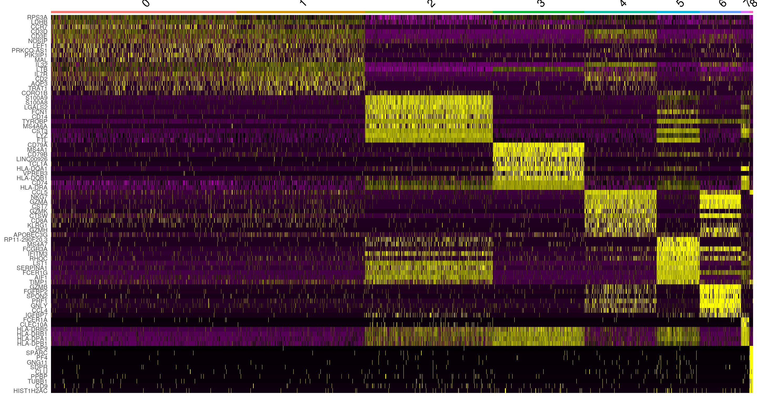
this (taken from Satija V3 tutorial).

My original code:

library(Seurat)
DoHeatmap(object = object, genes.use = top20_pos$gene)

produces the following image which is not what I want: enter image description here
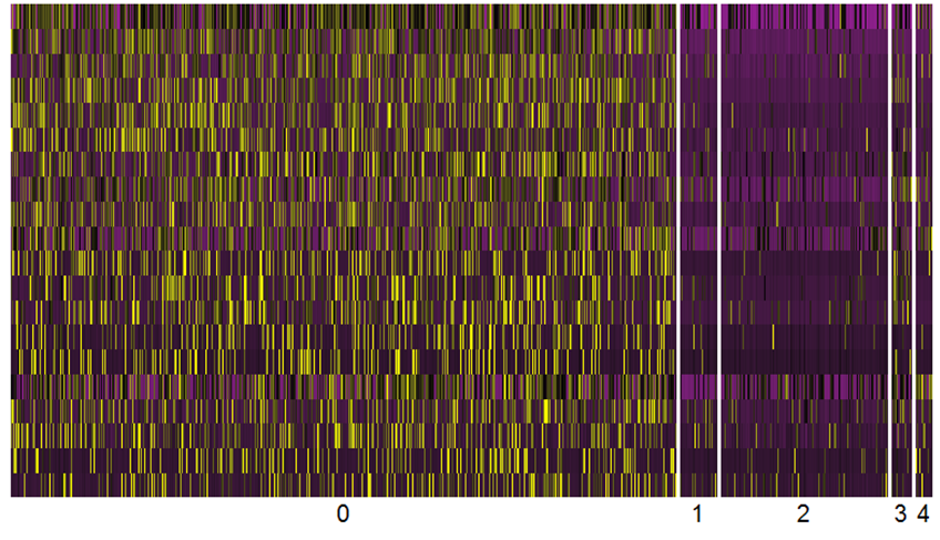
I am aware that DoHeatmap function returns a ggplot2 object but after searching the internet for a long time, I have not been able to find which geom layer I can add to achive my objective.

On the other hand, I have tried to generate a separate coloured annotation bar from another package called ComplexHeatmap with the intention of cropping it to fit the cluster demarcations on my heatmap generated with DoHeatmap but this has proven to be very time-consuming and inaccurrate:

library(ComplexHeatmap)

df = data.frame(type = c(rep("a", 18), rep("b", 3), rep("c", 2), rep("d", 1), rep("e", 1)))
ha = HeatmapAnnotation(df = df, col = list(type = c("a" =  "blue", "b" = "red", "c" = "green", "d" = "cyan", "e" = "magenta")))
draw(ha, 1:25)

which produces: enter image description here

I will be very grateful for any hint on how to achieve my goal automatically and accurately.

Thank you in advance for your help.

$\endgroup$
5
  • $\begingroup$ @h3ab74 It is a Seurat object which has been normalised, scaled, PCA analysed, TSNE analysed, clustered and from which differential gene expression has been calculated. All steps have been carried out with Seurat v2 methods. $\endgroup$
    – Charles
    Commented May 9, 2019 at 18:56
  • 1
    $\begingroup$ bc If you can somehow derive the expression matrix being used to create this heatmap from the seurat object, you can use the ColSideColors argument in the heatmap.2 function, and pass a vector of colors through it to get this representation.. It would be something like heatmap.2(exrs.mat, ColSideColors = color_array) $\endgroup$
    – h3ab74
    Commented May 9, 2019 at 23:12
  • 1
    $\begingroup$ If you want a simple solution, update the Seurat object to v3 and make the plot. You don't have to do the whole analysis again using v3, just use UpdateSeuratObject. $\endgroup$
    – TimStuart
    Commented May 19, 2019 at 15:33
  • $\begingroup$ @TimStuart Thank you it worked. But is there a possibility to change the colours used on the heat map? I wish to use the blue and red colours. $\endgroup$
    – Charles
    Commented May 20, 2019 at 12:44
  • $\begingroup$ You can use annotation_raster() from ggplot2 for this. ggplot2.tidyverse.org/reference/annotation_raster.html. If you don't need the separation (white lines in between the groups) this should be pretty straightforward. Otherwise, seurat uses empty cells (NA) to separate the groups. This is a little trickier to implement yourself. $\endgroup$
    – Mack123456
    Commented Aug 18, 2019 at 14:35

2 Answers 2

1
$\begingroup$

I am not sure if it's a v3 or also v2 thing, but have you tried by setting group.by and label?

From ?Seurat::DoHeatmap:

group.by   A vector of variables to group cells by; pass 'ident' to group by cell identity classes
label      Label the cell identies above the color bar

If you prefer external tools, you can use pheatmap and setting annotation_col e annotation_colors.

First define a data.frame (df) containing the data you want in the bar (clusters in your case)

Description Condition
liver       Tumour
lung        Normal

Then you have to assign the colours

anno <- as.data.frame(df)
anno_colori <- list(
   Condition = c(Normal = '#FFC000', Tumour = '#0070C0'),
   Description = c(liver = '#D55E00', lung = '#66CC99')
)

pheatmap(mat,
     annotation_col = anno,
     annotation_colors = anno_colori,
)

The code above will add 2 bars on the top of your heatmap, one for Condition and another for Description.

$\endgroup$
0
$\begingroup$

There was a discussion about this in Seurat developer's github and someone actually made a package to easily add several color bars using some DoHeamap-like function. Check it here.

$\endgroup$

Your Answer

By clicking “Post Your Answer”, you agree to our terms of service and acknowledge you have read our privacy policy.

Not the answer you're looking for? Browse other questions tagged or ask your own question.