0
$\begingroup$

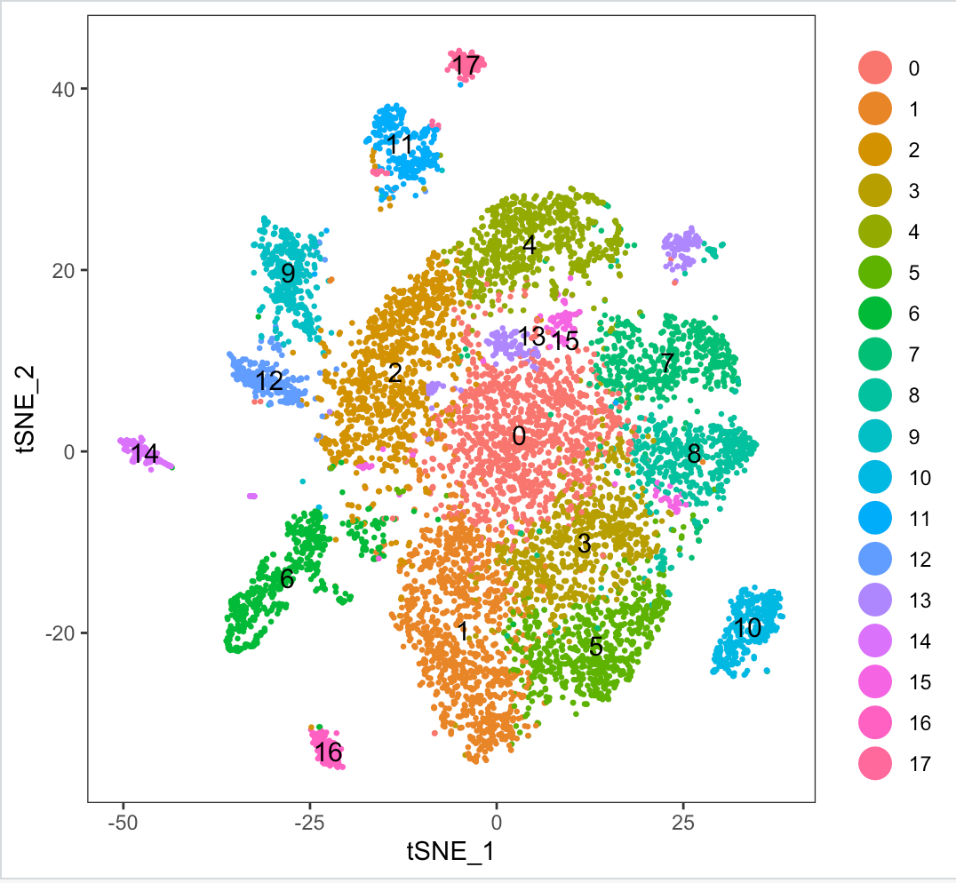
I am running a single cell dataset (count data - exon) through Seurat. After running tsne I see a cluster (13) split in 3 different locations on the plot. Here are the commands I am running:

library('Seurat')
## rows (genes) that have 99% zeros were filtered out, 
## and then columns (cells) that have 99% zeros were filtered out
isp.data <- read.table(file = "genes.cells99.percent.filtered", sep = 
            ",", row.names = 1, header=TRUE)
isp <- CreateSeuratObject(raw.data = isp.data, project = 
       "brain_regions")
isp <- NormalizeData(object = isp, normalization.method = 
       "LogNormalize",scale.factor = 10000)
isp <- FindVariableGenes(object = isp, mean.function = ExpMean, 
       dispersion.function = LogVMR,do.plot = FALSE)
hv.genes <- head(rownames([email protected]), 1000)
isp <- ScaleData(object = isp, genes.use = hv.genes, num.cores = 3)
isp <- RunPCA(object = isp, pc.genes = hv.genes, pcs.compute = 100, 
       do.print = TRUE, pcs.print = 1:5, genes.print = 5)
PCElbowPlot(object = isp, num.pc = 100)
isp <- JackStraw(object = isp, num.replicate = 100, display.progress = 
                 FALSE, num.pc = 30)
JackStrawPlot(object = isp, PCs = 1:30)
isp <- FindClusters(object = isp, reduction.type = "pca", dims.use = 
        1:26, resolution= 0.75, print.output = 0, save.SNN = TRUE, 
        force.recalc=TRUE)
isp <- RunTSNE(isp, dims.use = 1:26, do.fast = T)
TSNEPlot(isp, do.label = T, pt.size = 0.5)

Here is the tsne plot:

enter image description here

I have tried varying parameters for resolution in FindClusters (from 0.5-3.5), but that just increases the clusters found. Further I tried to play around with parameters min.dist (0.75,1), n_neighbors (10 to 30) and perplexity(5 to 50) but I still get at least 1-2 clusters split in the tsne plot.

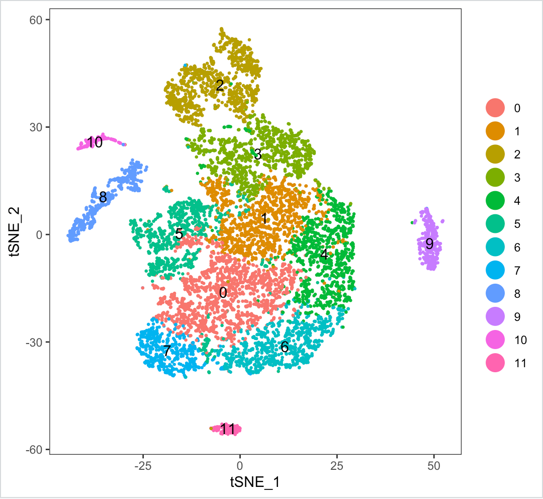
Another thing I have tried is to reduce the dimension (dims.use=10) on which tsne is ran but the clusters seem to be too close together, like so:

dims_reduced

Note: Dimensionality of dataset (after filtering) - 23824 genes across 8967 samples.

My question being why does such behavior happen? Is my filtering strategy not correct? Have I not normalized/scaled data correctly?
$\endgroup$

1 Answer 1

3
$\begingroup$

Your cluster labels come from graph clustering implemented in the FindClusters() function. The resulting clusters are then visualised with a 2D tSNE plot (via RunTSNE() and TSNEPlot()). So, your cluster 13 is not split into three sub-clusters but cells within cluster 13 look somewhat distant from each other on the tSNE plot. Having mentioned distances on a tSNE plot, please see this SE Data Science entry Can closer points be considered more similar in T-SNE visualization? and especially the comment "What I mean is that you can't just use distance in the lower space as a similarity criterion". In your case "the lower space" would be your tSNE plot.

As far as I can see from your code, you are following the widely-adopted "Seurat workflow" and all seem fine including your TSNE plot output. I could not spot the QC step though: apart from the one at object initiation, one usually applies filters for number of genes and % mitochondrial gene contribution (using FilterCells() in Seurat v2 and subset() in Seurat v3).

It would be a good idea to try UMAP instead of tSNE, please see Evaluation of UMAP as an alternative to t-SNE for single-cell data (Becht et al, 2019). Seurat v3 vignettes are now using UMAP and not tSNE any more.

Lastly, please see How to Use t-SNE Effectively to learn about points to take into account when using/interpreting tSNE plots. You will see that you would get surprisingly dissimilar tSNE plots from the same underlying data with different parameters (some are hardcoded in the RunTSNE() function).

$\endgroup$
3
  • $\begingroup$ Yes, I was missing step where I needed to filter for mitochondria and number of genes. $\endgroup$ Commented Aug 22, 2019 at 18:23
  • $\begingroup$ Great and very comprehensive answer! $\endgroup$
    – jxx_fa
    Commented Aug 23, 2019 at 9:22
  • $\begingroup$ Hi user2998764, I was just curious, do the tSNE plot looks "better" after the QC for % mito and genes? $\endgroup$
    – haci
    Commented Aug 23, 2019 at 9:44

Your Answer

By clicking “Post Your Answer”, you agree to our terms of service and acknowledge you have read our privacy policy.

Not the answer you're looking for? Browse other questions tagged or ask your own question.