1
$\begingroup$

I have 2 groups of patients; responders to chemotherapy and non-responders

I have calculated cancer cell fraction (CCF) of a set of driver genes (by variant allele frequency) for each group and I have

> head(dat)
    Response       CCF
1 Responders 1.0000000
2 Responders 0.5413323
3 Responders 1.0000000
4 Responders 1.0000000
5 Responders 1.0000000
6 Responders 1.0000000

unique(dat$Response)


[1] Responders    Nonresponders
Levels: Nonresponders Responders
> 

If CCF > 0.95 , the mutation is clonal otherwise sub clonal

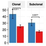
I want to show how many clone and subclone are in these two groups by box plot or something similar like below

enter image description here

I have tried this which was nonsense

ggplot(dat, aes(x=Response, y=CCF)) + 
    geom_boxplot()

Can you help me?
$\endgroup$

1 Answer 1

1
$\begingroup$

I'm not sure that boxplot will be the more appropriate representation, as you will end with two numbers (count of Clonal and SubClonal) per groups of patients.

One solution will be to first create a new categorical variable based on CCF values using for example ifelse statement for example by writing:

df$Clonal <- ifelse(df$CCF > 0.95,"Clone","SubClonal")

Then you can get the count of each Clone and subclone for each responders and non responders by using table:

DF <- as.data.frame(table(df[,c("Response","Clonal")]))

You can finally convert these new values as percentage by grouping according to the Response. For example, using dplyr, you can do something like that:

library(dplyr)

DF %>% group_by(Response) %>% mutate(Freq_percent = Freq / sum(Freq))

And finally, you can plot it as a barchart or single point in ggplot2. Hope it helps you to figure it out how to deal with your data.

$\endgroup$

Your Answer

By clicking “Post Your Answer”, you agree to our terms of service and acknowledge you have read our privacy policy.

Not the answer you're looking for? Browse other questions tagged or ask your own question.