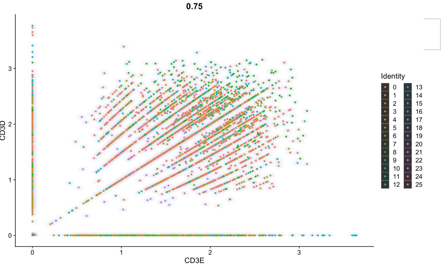
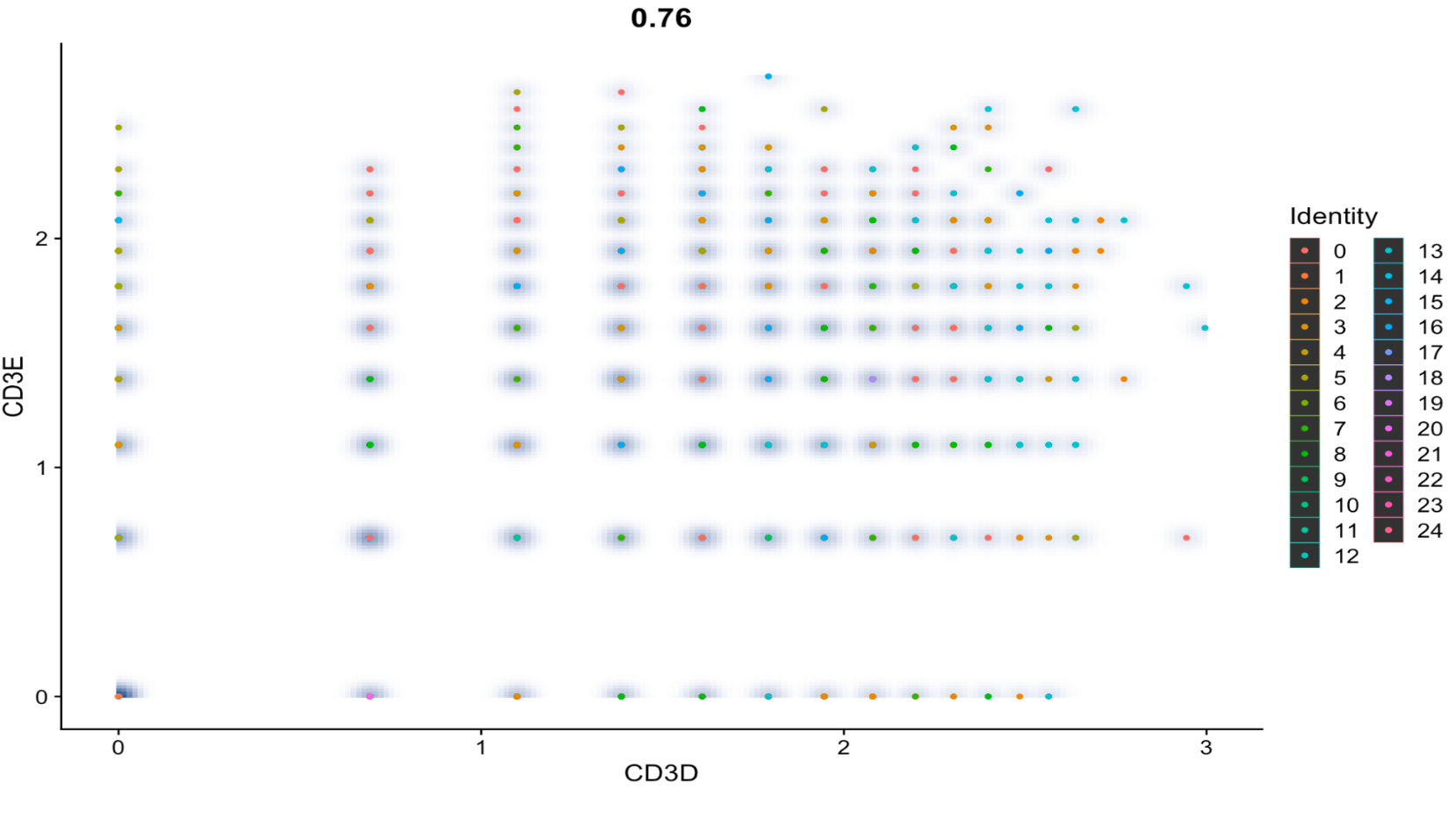
I' am doing a sc-Seq analysis on a dataset from 10x genomics, using Seurat. I followed the standard workflow and I also did it with the SCTransform workflow. The results are very different when I plot a Feature Scatter with the same 2 genes.
So I was wondering why they were so different. I know that the perfect lines in the first one happen because of the normalization and that it usually means that I need more data. But I don't understand why the SCTransform one. looks like it has less data and why it looks so perfectly arranged. My goal is to make a plot that looks normal and natural, and that may or may not have a visual correlation; instead of this weirdly looking and unnatural plots. If you also have a tip for this, I would be very grateful. Thanks in advance.
Here is my code for the normal workflow:
library(Seurat)
library(tidyverse)
library(ggplot2)
library(gridExtra)
library(harmony)
library(future.apply)
library(cowplot)
library(patchwork)
library("DESeq2")
library(SeuratData)
library(SeuratDisk)
library(SeuratWrappers)
library(sctransform)
data <- Read10X(data.dir = "/Users/rodrigohermoza/Desktop/UTEC/2024-0/PoliSia/rstudio/diferential_expression_2/DE2/filtered_gene_bc_matrices/raw_feature_bc_matrix/")

pbmc <- CreateSeuratObject(counts = data, project = "DE3")
pbmc <- PercentageFeatureSet(pbmc, pattern = "^MT-", col.name = "percent.mt")
pbmc <- subset(pbmc, subset = nFeature_RNA > 200 & percent.mt <15 & nCount_RNA > 50)
pbmc <- NormalizeData(pbmc)
pbmc <- FindVariableFeatures(pbmc, nfeatures = 3000)
pbmc <- ScaleData(pbmc, vars.to.regress = "percent.mt")
pbmc <- RunPCA(pbmc)
pbmc <- FindNeighbors(pbmc, dims = 1:21)
pbmc <- FindClusters(pbmc, resolution = 1)
pbmc <- RunUMAP(pbmc, dims = 1:21)
DimPlot(pbmc, label = TRUE)
sweep_res <- paramSweep(pbmc,PCs = 1:20, sct = FALSE)
sweep_stat <- summarizeSweep(sweep_res, GT = F)
bcmv <- find.pK(sweep_stat)
ggplot(bcmv, aes(pK, BCmetric, group = 1)) +
  geom_point()+
  geom_line()

#0.005
pK<- bcmv %>%
  filter(BCmetric == max(BCmetric)) %>%
  select(pK)
pK<- as.numeric(as.character(pK[[1]]))
annotations <- [email protected]$seurat_clusters
homotipic <- modelHomotypic(annotations)
exp <- round(0.08*nrow([email protected]))
exp.adj <- round(exp*(1-homotipic))
pbmc <- doubletFinder(pbmc,
                          PCs = 1:20,
                          pK = pK,
                          nExp = exp.adj,
                          reuse.pANN = F,
                          sct = F)
DimPlot(pbmc, reduction = "umap", group.by = "DF.classifications_0.25_0.11_818")
table([email protected]$DF.classifications_0.25_0.11_818)
pbmc_filtered <- subset(pbmc, subset = DF.classifications_0.25_0.11_818 == "Singlet")
pbmc.markers <- FindAllMarkers(pbmc_filtered)
FeatureScatter(pbmc_filtered, feature1 = "CD3D", feature2 = "CD3E", slot = "data")
And here is my SCTransform workflow
library(Seurat)
library(tidyverse)
library(ggplot2)
library(gridExtra)
library(harmony)
library(future.apply)
library(cowplot)
library(patchwork)
library("DESeq2")
library(SeuratData)
library(SeuratDisk)
library(SeuratWrappers)
library(sctransform)
library(DoubletFinder)
data <- Read10X(data.dir = "/Users/rodrigohermoza/Desktop/UTEC/2024-0/PoliSia/rstudio/diferential_expression_2/DE2/filtered_gene_bc_matrices/raw_feature_bc_matrix/")
pbmc <- CreateSeuratObject(counts = data, project = "DE3")
pbmc <- PercentageFeatureSet(pbmc, pattern = "^MT-", col.name = "percent.mt")
pbmc <- subset(pbmc, subset = nFeature_RNA > 200 & percent.mt <15 & nCount_RNA > 50)
pbmc <- SCTransform(pbmc, vars.to.regress = "percent.mt")
pbmc <- RunPCA(pbmc)
ElbowPlot(pbmc,ndims = 50)
pbmc <- FindNeighbors(pbmc, dims = 1:20)
pbmc <- FindClusters(pbmc, resolution = 1)
pbmc <- RunUMAP(pbmc, dims = 1:20)
DimPlot(pbmc, label = TRUE)
pbmc.markers <- FindAllMarkers(pbmc)
FeatureScatter(pbmc, feature1 = "CD3D", feature2 = "CD3E", slot = "data", smooth = T)

