I have a dataset of Oxford Nanopore cDNA reads. Many of my reads are full-length or close to full-length transcripts, and I and am interested in examining alternative splicing. For this, I would like to begin by visualising my reads and comparing variants qualitatively.
I have tried visualising my data in both IGV and SeqMonk, but neither has given a satisfying result.
IGV
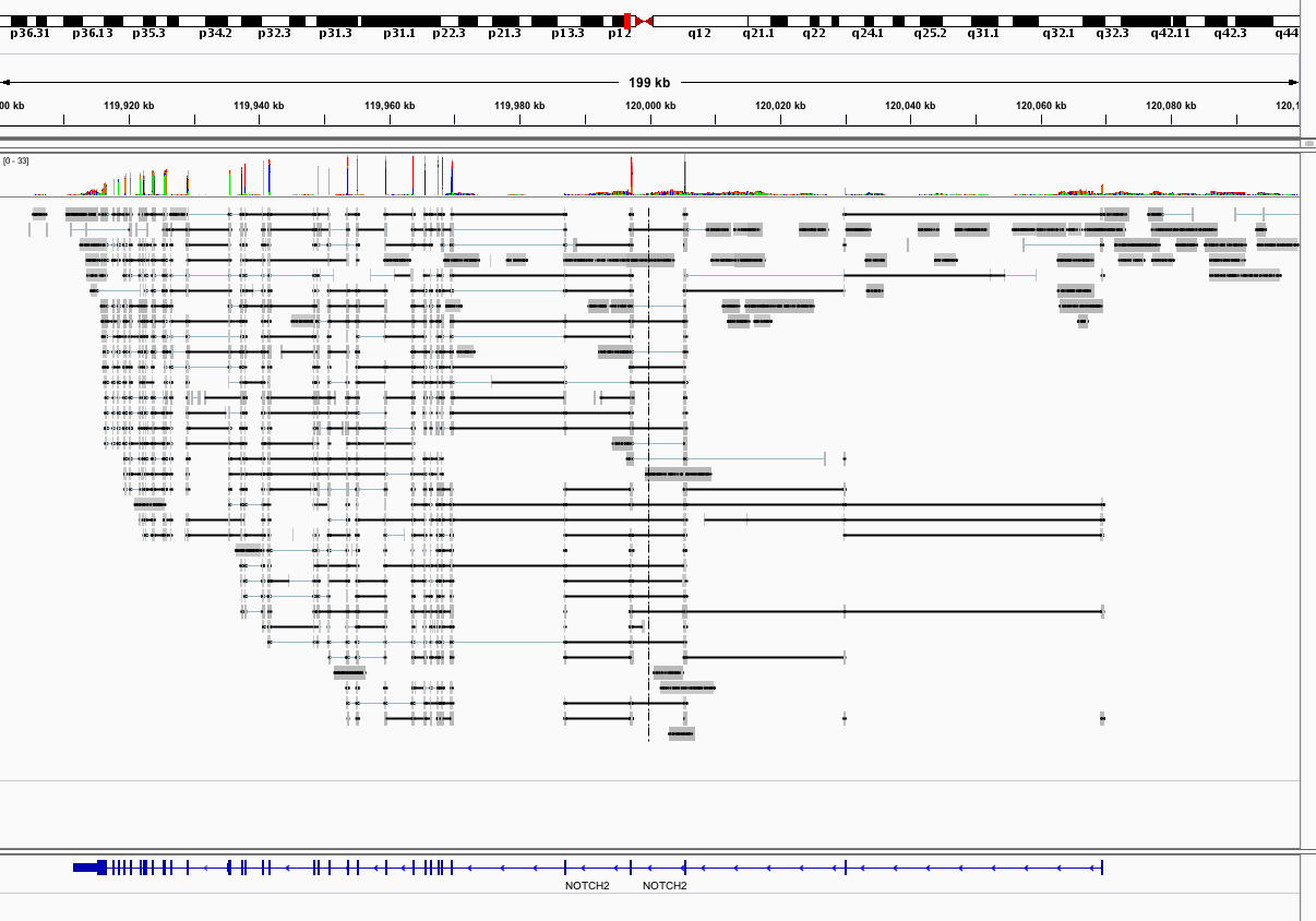
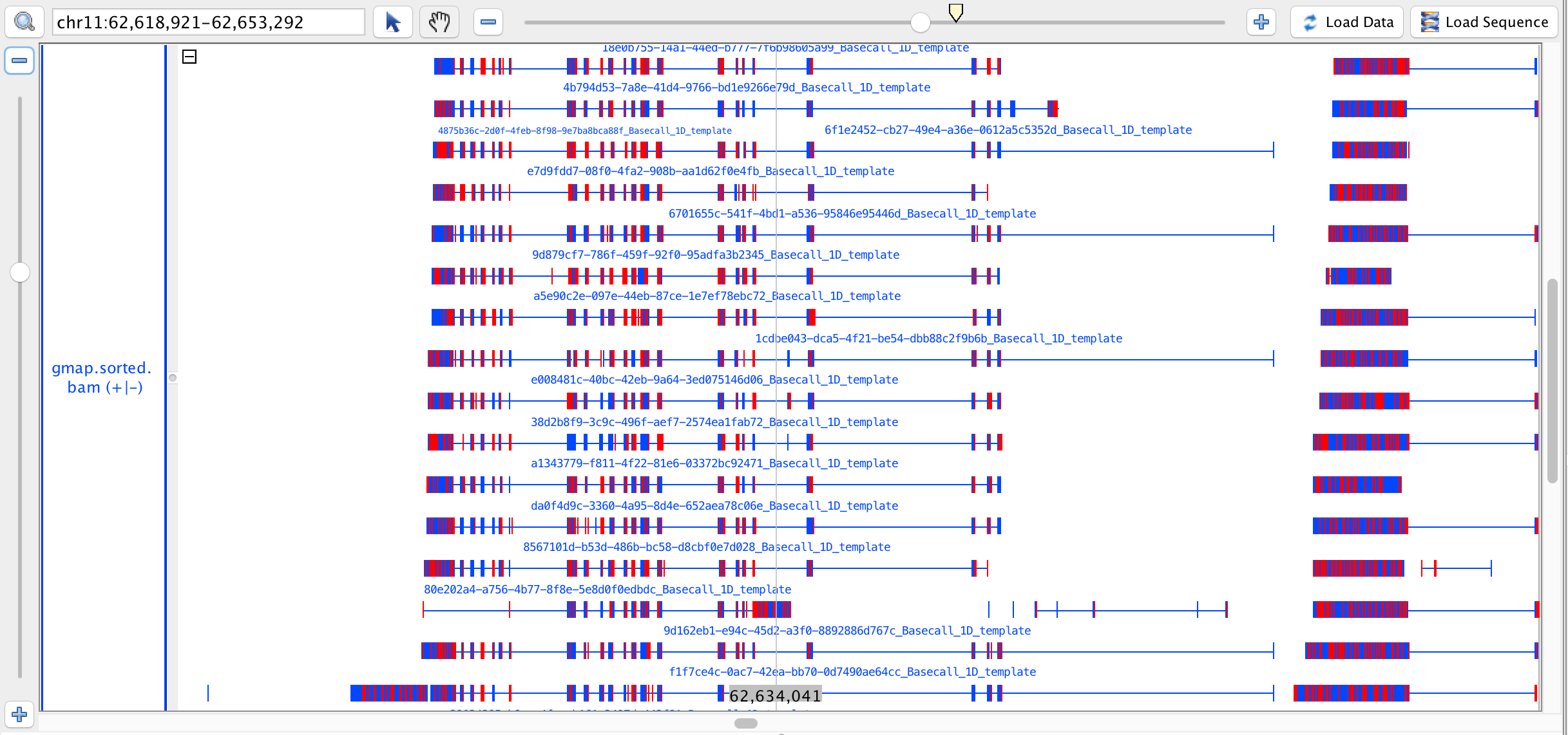
IGV shows some links between aligned sections, shown as fine blue lines and thick black lines. I cannot work out what the difference between these lines is, and even more confusingly, we have numerous alignments where two aligned exons come from the same sequence but are not joined by any line. This means that, to confirm or deny a spliced variant, I need to manually examine the read ID of each exon.
SeqMonk
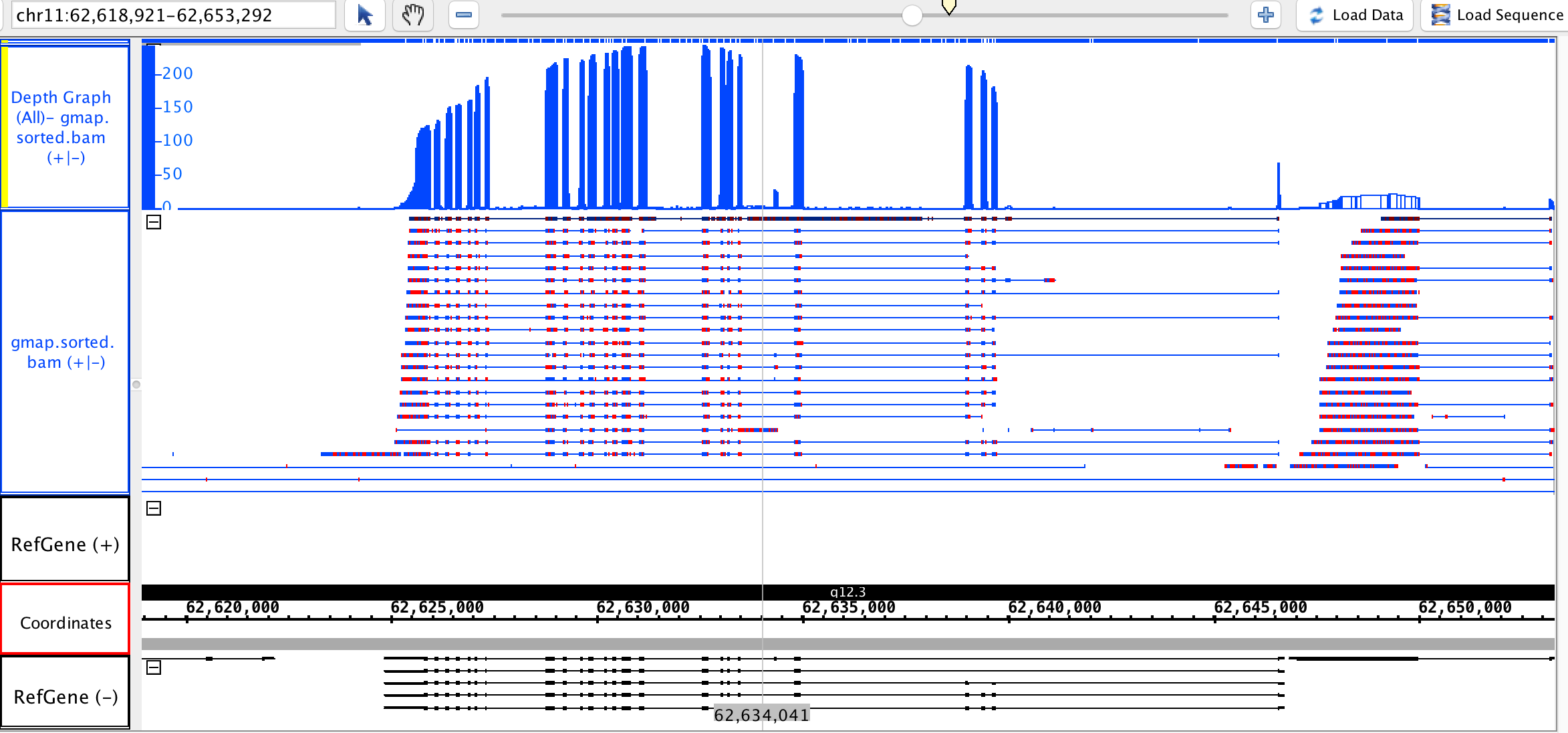
SeqMonk gives a much cleaner visualisation, but unfortunately shows no links between aligned exons, and worse, I cannot find the read IDs. This means there is functionally (as far as I can see) no way to tell which exons come from the same read.
EDIT: Sashimi Plot
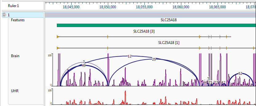
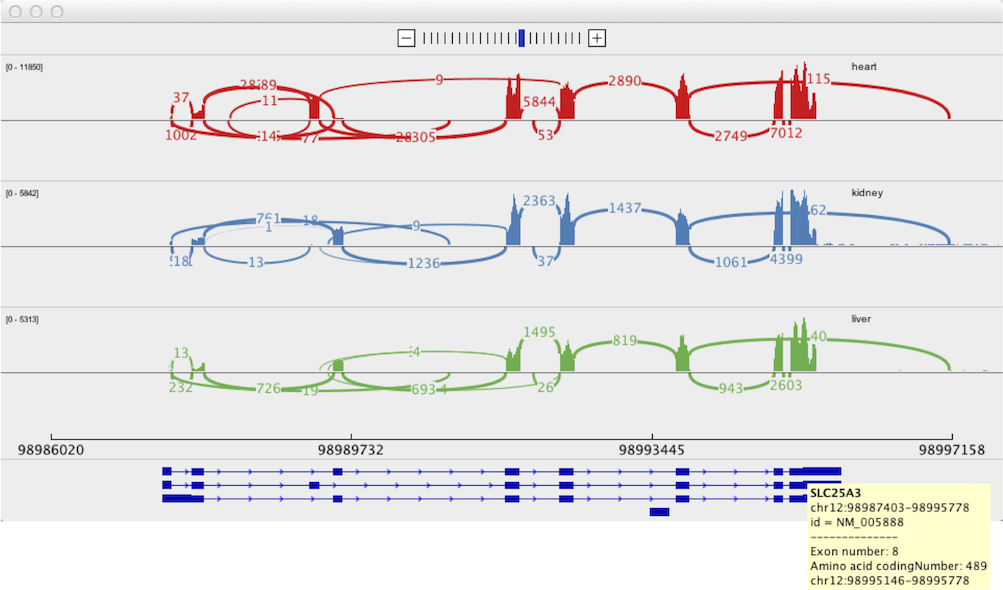
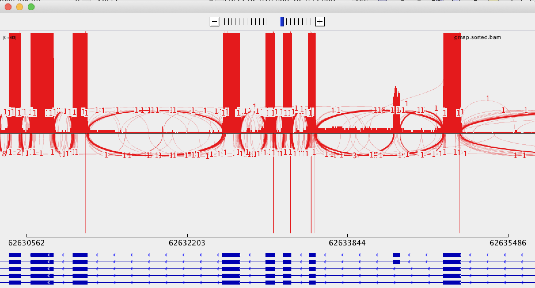
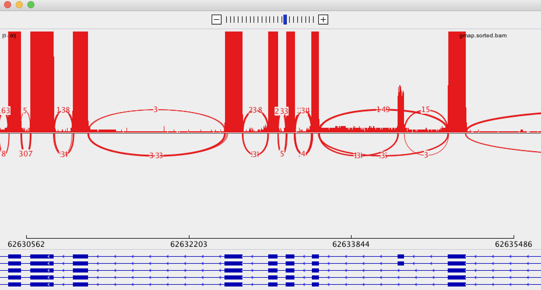
As recommended in this answer, I have tried using IGV's Sashimi Plot. Unfortunately, I believe the high error rate and relatively low coverage is causing this to create somewhat confusing output. The Sashimi Plot shows mostly nearly every junction to have just a single read supporting it.
Is there a visualisation tool which allows simple examination of splicing of full-length transcripts?
