1
$\begingroup$

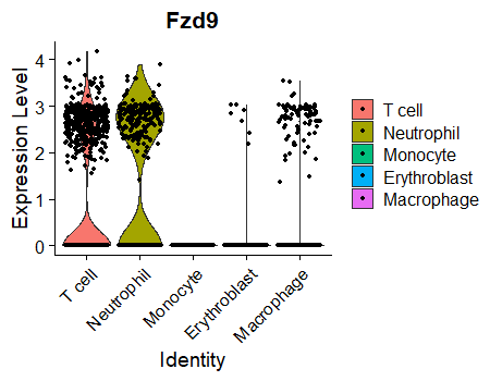
Seurat VlnPlots are most commonly used to visualize differences in any given gene expression across multiple clusters or cell types. For example:

VlnPlot(object = MouseCellAtlas, idents = c("T cell","Neutrophil","Erythroblast","Monocyte","Macrophage"), features = 'Fzd9')

Seurat VlnPlot for a single gene in multiple cluster idents

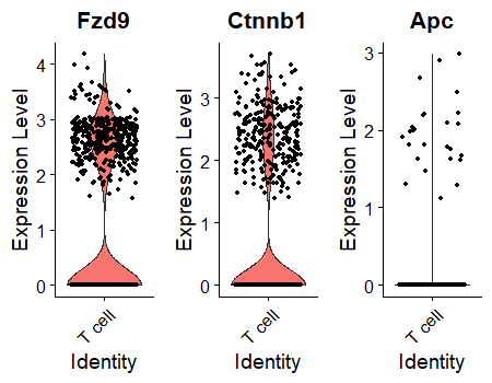
But suppose I want to view the expression of several genes in just idents = "T cell". I can do this to generate three separate plots:

VlnPlot(object = mca, idents = 'T cell', features = c('Fzd9','Ctnnb1','Apc'), combine = TRUE, ncol = 3)

Seurat plot for multiple genes in a single cluster ident

But ideally I'd like this second plot to look just like the first plot, except with only a single tissue on the legend ("T cell") and multiple genes in the various colored violins. Unfortunately, I am not aware of any simple way to combine these violins into a single plot area.

This doesn't do what I need:

VlnPlot(object = mca, idents = 'T cell', features = c('Fzd9','Ctnnb1','Apc'), combine = TRUE, ncol = 3)

Is there built-in functionality in Seurat for generating a VlnPlot for multiple genes in a single tissue in a single plot? Or can anyone suggest a workaround?
$\endgroup$

1 Answer 1

2
$\begingroup$

To do so one workaround it to have your data in "long format" and then use the column that holds the "gene names" as the x variable while plotting.

You can use FetchData() to extract data from a Seurat object. VlnPlot's default is the data slot (of the active assay if using Seurat v3 I suppose). And you can specify which cells and genes to retrieve.

selected_cells <- names(panc8$celltype[panc8$celltype == "gamma"])
data <- FetchData(panc8,
                    vars = c('FZD9','CTNNB1','APC'),
                    cells = selected_cells ,
                    slot = "data")
> head(data)
           FZD9   CTNNB1      APC
D101_5        0 0.000000 0.000000
D101_43       0 2.007853 1.001958
D101_93       0 0.000000 0.000000

Melt() would transform your data into "long format". By not specifying any arguments, we push for all of the info in the three variables to be gathered in two columns:

long_data <- melt(data)
No id variables; using all as measure variables
> head(long_data)
  variable value
1     FZD9     0
2     FZD9     0
3     FZD9     0

> tail(long_data)
     variable value
1870      APC     0
1871      APC     0
1872      APC     0

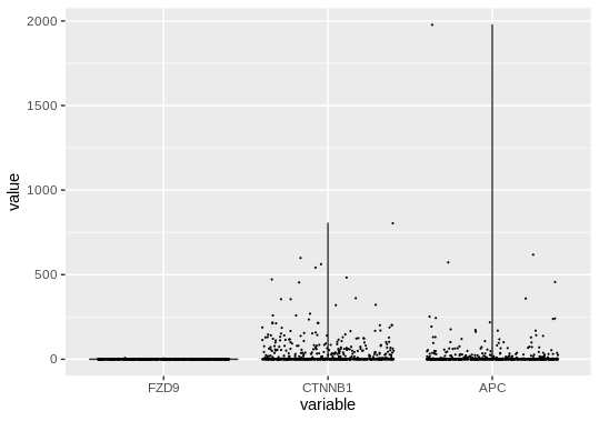
ggplot2 is used to add "violin" and "jitter" layers. You can customize the output to look (exactly) like the VlnPlot() output.

ggplot(long_data,
       aes(x = variable, y = value)) +
  geom_violin() +
  geom_jitter(size = 0.1)

enter image description here

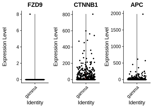
And here is the same graph generated by VlnPlot():

enter image description here

There are no "violins" as the counts are almost entirely zeros. And see how different the ranges are in the y axes of the VlnPlot. So the "tweak" I have presented here would only work for genes that are expressed at similar levels / similar ranges.

$\endgroup$
1
  • $\begingroup$ thanks, this works well! The general approach will be useful moving forward with a number of other analyses as well. Thanks! $\endgroup$
    – zdebruine
    Commented Nov 18, 2019 at 10:16

Your Answer

By clicking “Post Your Answer”, you agree to our terms of service and acknowledge you have read our privacy policy.

Not the answer you're looking for? Browse other questions tagged or ask your own question.