3
$\begingroup$

I have a matrix data with cells as rows and samples as columns. Here I am giving the data with dput

dput(data)

structure(c(0, 0, 0.0095, 0.0091, 0, 0.0195, 0, 0.006, 0.0023, 
0.0035, 0, 0.0306, 0, 0.0859, 0, 0, 0.0059, 0.0229, 0, 5e-04, 
0, 0.0116, 0.0173, 0.0076, 0.0133, 0.0344, 0, 0.1263, 0, 0, 0.0378, 
0, 0, 0.0198, 0, 0.0268, 0, 0, 0.0044, 0.0607, 0, 0.0073, 0, 
0.1343, 0.0016, 0.0864, 0, 0, 0, 0.0296, 0.0122, 0.0329, 0.0204, 
0.0582, 0, 0, 0.003, 0.1011, 0, 0, 0, 0, 0.0124, 0.0013, 0, 0.0025, 
0.0076, 0.0498, 0, 0.0103, 2e-04, 0.0562, 0.0673, 0.069, 0, 0.0297, 
0, 0.0207, 0.0329, 0.0072, 0.0028, 0.0589, 0.0533, 0.0139, 0, 
0.0791, 0.0361, 0.026, 0, 0.0036, 0, 0.0319, 0.0155, 0.0401, 
0.064, 0.0743, 0.0026, 0.012, 0, 0.0089, 0.0468, 0.0994, 0, 0.0646, 
0, 0.0391, 0.0209, 0.0051, 0.007, 0.0689, 0, 0.0218, 0, 0, 0.0157, 
0, 0, 0.0119, 0, 0.0136, 0, 0.0036, 0.0016, 0.0583, 0, 0, 0.0031, 
0.2211, 0.6257, 0, 4e-04, 0.173, 0.0557, 0.1104, 0.0288, 0.0474, 
0, 0.0078, 0.0914, 0.0289, 0.0293, 0.1067, 0, 0.0121, 0, 0, 0.018, 
0, 0.021, 0.039, 0.0146, 0.043, 0.0367, 0.0245, 0, 0, 0, 0, 0, 
0.0097, 0, 0.003, 0.0072, 0.017, 0.0061, 0.0453, 0, 0.0587, 0, 
0, 0.1009, 0.0231, 0, 0.0279, 0, 0.048, 0.01, 0, 0.0083, 0.0355, 
0, 0.1058, 0, 0, 0.0634, 0.0138, 0, 0.0116, 0, 0.0683, 0, 0, 
0.0229, 0.064, 0, 0, 0, 0, 0.0222, 0.005, 0, 0.0176, 0, 0.0291, 
0.0017, 0.008, 0.003, 0.0693, 0, 0.0156, 0.0038, 0.0577, 0, 0, 
0, 0, 0.0521, 0, 0, 0.0017, 0, 0.0218, 0.1336, 0, 0, 0, 0, 0, 
0, 0.0398, 0, 0.0099, 9e-04, 0.0046, 0.0055, 0.0361, 0.0382, 
0.0168), .Dim = c(14L, 17L), .Dimnames = list(c("Cell1", "Cell2", 
"Cell3", "Cell4", "Cell5", "Cell6", "Cell7", "Cell8", "Cell9", 
"Cell10", "Cell11", "Cell12", "Cell13", "Cell14"), c("Sample1", 
"Sample2", "Sample3", "Sample4", "Sample5", "Sample6", "Sample7", 
"Sample8", "Sample9", "Sample10", "Sample11", "Sample12", "Sample13", 
"Sample14", "Sample15", "Sample16", "Sample17")))

Annotation of samples is in a dataframe df look likes this:

dput(df)

structure(list(Samples = c("Sample2", "Sample6", "Sample7", "Sample8", 
"Sample9", "Sample10", "Sample11", "Sample16", "Sample17", "Sample1", 
"Sample3", "Sample4", "Sample5", "Sample12", "Sample13", "Sample14", 
"Sample15"), Group = c("A", "A", "A", "A", "A", "A", "A", "A", 
"A", "B", "B", "B", "B", "B", "B", "B", "B")), row.names = c(NA, 
-17L), class = c("tbl_df", "tbl", "data.frame"))

Using the above data and annotation with below code I made a heatmap:

#Associated libraries
library(ComplexHeatmap)
library(RcolorBrewer)
library(circlize)

#Set annotation
ann <- data.frame(df$Group)
colnames(ann) <- c("Group")
colours <- list("Group"=c("A"="orange","B"="darkgreen"))
colAnn <- HeatmapAnnotation(df=ann, which="col", col=colours, annotation_width=unit(c(1, 4), "cm"), gap=unit(1, "mm"))

myCol <- colorRampPalette(c("#ffffff","#0030dd", "#3259e3", "#7f97ee"))(100)
myBreaks <- seq(0,1, length=100)
hmap <- Heatmap(data, name = "xCell scores", col = colorRamp2(myBreaks, myCol),
                width = unit(100, "mm"),show_row_names = TRUE, show_column_names = FALSE, cluster_rows = FALSE,
                cluster_columns = FALSE, show_column_dend = FALSE, show_row_dend = FALSE,
                row_dend_reorder = FALSE, column_dend_reorder = FALSE, clustering_method_rows = "ward.D2",
                top_annotation=colAnn)
draw(hmap,heatmap_legend_side="right", annotation_legend_side="right")

The heatmap looks like this:

enter image description here

But I want to sort the rows (cell1 to cell14) keeping the cell4 (interested cell) on the top and also keep the samples with values (coloured in blue in heatmap) together and samples with 0 values (white coloured) following that.

It should look something like the below heatmap which is from the Figure 4a in this research paper heatmap
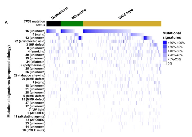
As you see in this heatmap all the coloured samples are together.

This must be done with some sorting and using transform, but not able to make it.

Any help is appreciated. thank you in advance.
$\endgroup$
4
  • $\begingroup$ complex heatmap oncoprint might help but will run it on your data and get back to you. $\endgroup$
    – kcm
    Commented Aug 5, 2019 at 18:49
  • $\begingroup$ The pattern in Figure 4A is created by sorting row 16 (unknown) in each of the 3 groups (Deleterious, Missense, and Wild-type). This new order can then be given to the Heatmap function with argument column_order = vector, where vector is this new order. $\endgroup$
    – benn
    Commented Aug 6, 2019 at 8:07
  • $\begingroup$ Yes, I know this but there are more than 60 cell types. can't make a vector of all types... $\endgroup$
    – beginner
    Commented Aug 6, 2019 at 8:22
  • $\begingroup$ Okay, I understand what you mean now, you might want to use a nested sort of let's say the first 10 cell types (depending on how many columns you have in the real data). Nesting can be done by adding the following cell types in the order function. $\endgroup$
    – benn
    Commented Aug 6, 2019 at 9:13

2 Answers 2

1
$\begingroup$

You are almost there except for a few tricks:

If you want columns to be ordered using the values in Cell 4, you will need to provide a custom column order either with the column_order argument of the Heatmap() function or by providing ordered data. Below is the code to perform the latter. Most of the code is yours, I just tweaked it a little.

library(tibble)
library(dplyr)
library(ComplexHeatmap)
library(RColorBrewer)
library(circlize)

# Since you want to use cell4 as reference
cell4 <- as.data.frame(t(data["Cell4",]))

df <- cbind(cell4,
            Group = as.character(ann$Group))

# ordering by Group and by expression value, minus denotes decreasing order
df <- df[with(df, order(Group,-Cell4)),]

# to make it compatible to your code in your post
df <- rownames_to_column(df, "Samples")

#Set annotation
ann <- data.frame(df$Group)
colnames(ann) <- c("Group")
colours <- list("Group" = c("A" = "orange", "B" = "darkgreen"))
colAnn <-
  HeatmapAnnotation(
    df = ann,
    which = "col",
    col = colours,
    annotation_width = unit(c(1, 4), "cm"),
    gap = unit(1, "mm")
  )

# rownames of the annotation df and the colnames of the data should be in
# the same order
data <- data[, df$Samples]

myCol <-
  colorRampPalette(c("#ffffff", "#0030dd", "#3259e3", "#7f97ee"))(100)
myBreaks <- seq(0, 1, length = 100)
hmap <-
  Heatmap(
    as.matrix(data),
    name = "xCell scores",
    col = colorRamp2(myBreaks, myCol),
    width = unit(100, "mm"),
    show_row_names = TRUE,
    show_column_names = FALSE,
    cluster_rows = TRUE, # you asked your cells to be ordered
    cluster_columns = FALSE, # column order is the same as the provided data
    show_column_dend = FALSE,
    show_row_dend = FALSE,
    row_dend_reorder = FALSE,
    column_dend_reorder = FALSE,
    clustering_method_rows = "ward.D2",
    top_annotation = colAnn,
    column_order = NULL
  )
draw(hmap,
     heatmap_legend_side = "right",
     annotation_legend_side = "right"

)

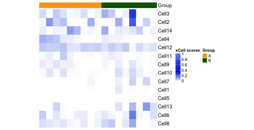
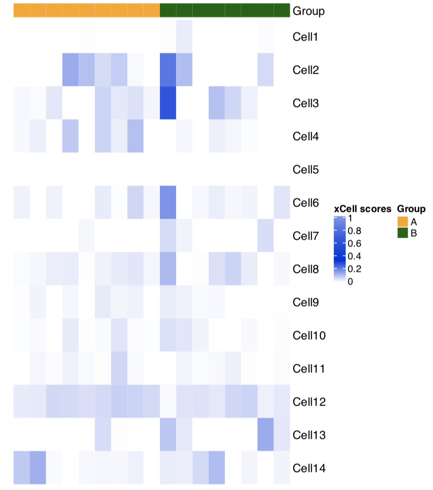
The resulting heatmap, still not quite what you want:enter image description here

You will realize that the values for Cell 4 are ordered from high to low for each of the two groups. To make Cell 4 be drawn at the top, you will need to reorder the rows. To do so, you will need to extract the row orders with the row_order() function:

> row_order(hmap)
 [1]  3  2 14  4 12 11  9 10  7  1  5 13  6  8

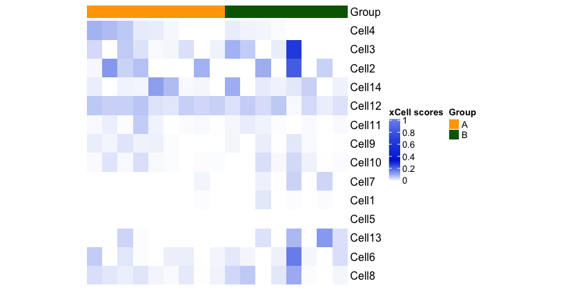
Now you can re-draw the heatmap after altering the row order somehow. For this sample case, doing it manually.

# promoting Cell 4 to the first position
modified_row_order <- c(4, 3, 2, 14, 12, 11,  9, 10,  7,  1,  5, 13,  6,  8)

hmap <-
  Heatmap(
    as.matrix(data),
    name = "xCell scores",
    col = colorRamp2(myBreaks, myCol),
    width = unit(100, "mm"),
    show_row_names = TRUE,
    show_column_names = FALSE,
    cluster_rows = FALSE, # set to FALSE as a custom row order is supplied
    cluster_columns = FALSE,
    show_column_dend = FALSE,
    show_row_dend = FALSE,
    row_dend_reorder = FALSE,
    column_dend_reorder = FALSE,
    clustering_method_rows = "ward.D2",
    top_annotation = colAnn,
    column_order = NULL,
    row_order = modified_row_order # argument to supply custom row order
  )
draw(hmap,
     heatmap_legend_side = "right",
     annotation_legend_side = "right")

enter image description here

If I have misunderstood your question and you do not want columns to be ordered according to expression values in Cell4, forget about the first part with the ordered annotation data frame.

$\endgroup$
0
$\begingroup$

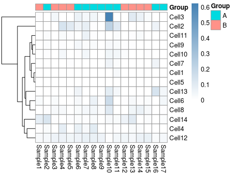
You may also use the excellent pheatmap package. It is highly customizable, so do not hesitate to look at its help page and examples found therein. The code may look like this: library(pheatmap) data<-as.data.frame(data) df<-data.frame(df, row.names=1) pheatmap(data, annotation_col = df, cluster_cols = F, color=colorRampPalette(c("white", "steelblue"))(100)) enter image description here

$\endgroup$

Your Answer

By clicking “Post Your Answer”, you agree to our terms of service and acknowledge you have read our privacy policy.

Not the answer you're looking for? Browse other questions tagged or ask your own question.