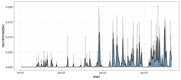
I'm generating a density plot using the ggplot2 library:
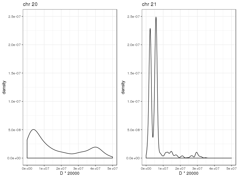
ggplot(df_chr20, aes(x=start1)) + geom_density() + theme_bw()
ggplot(df_chr21, aes(x=start1)) + geom_density() + theme_bw()
The data frame for df_chr20 has 1573 rows, and I wanted to plot the probability density of genomic regions as x = start1. The same for df_chr21, with 1271 rows. What I see in the plot is what I expect, but is there a reason why the y-axis probablilty densities are so low? The area under the curve is surely not equal to 1.
I expected the high localised high density in chr 21, and both the plots have similar scales in terms of y-axis values. But since they are so low, how can I interpret this plot?
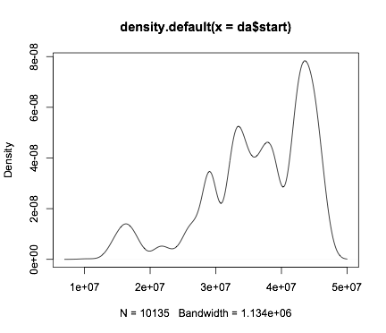
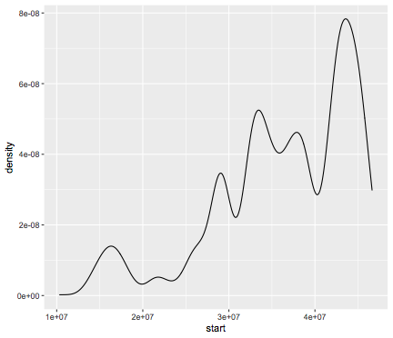
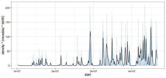
I found some information here, but my values are much lower than the examples.
Any help would be very kind!
