1
$\begingroup$

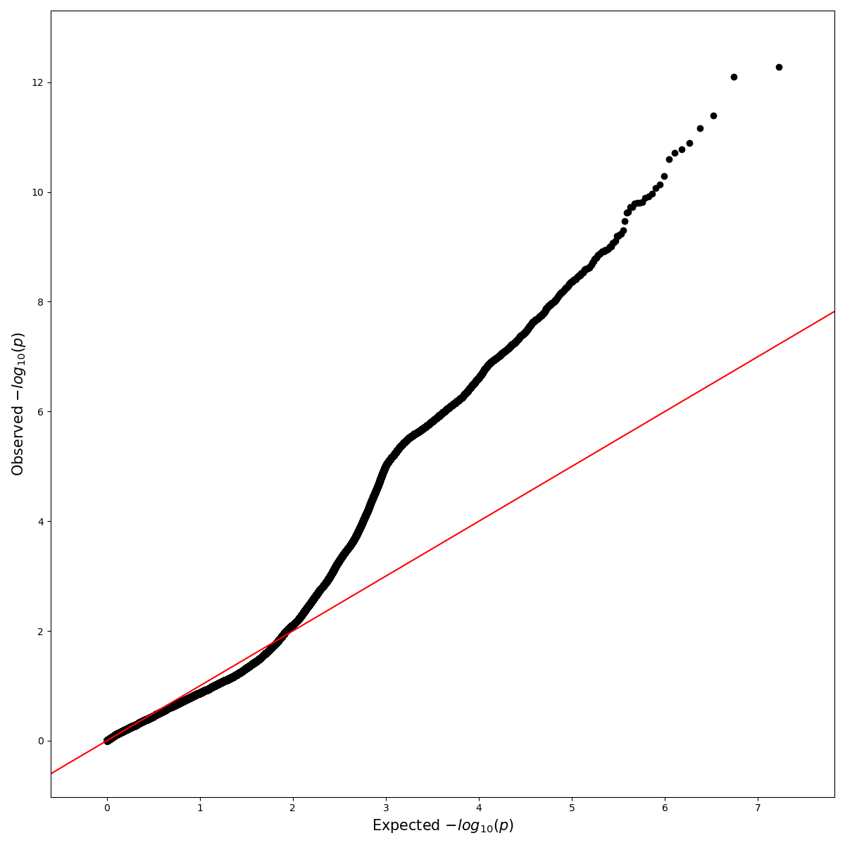
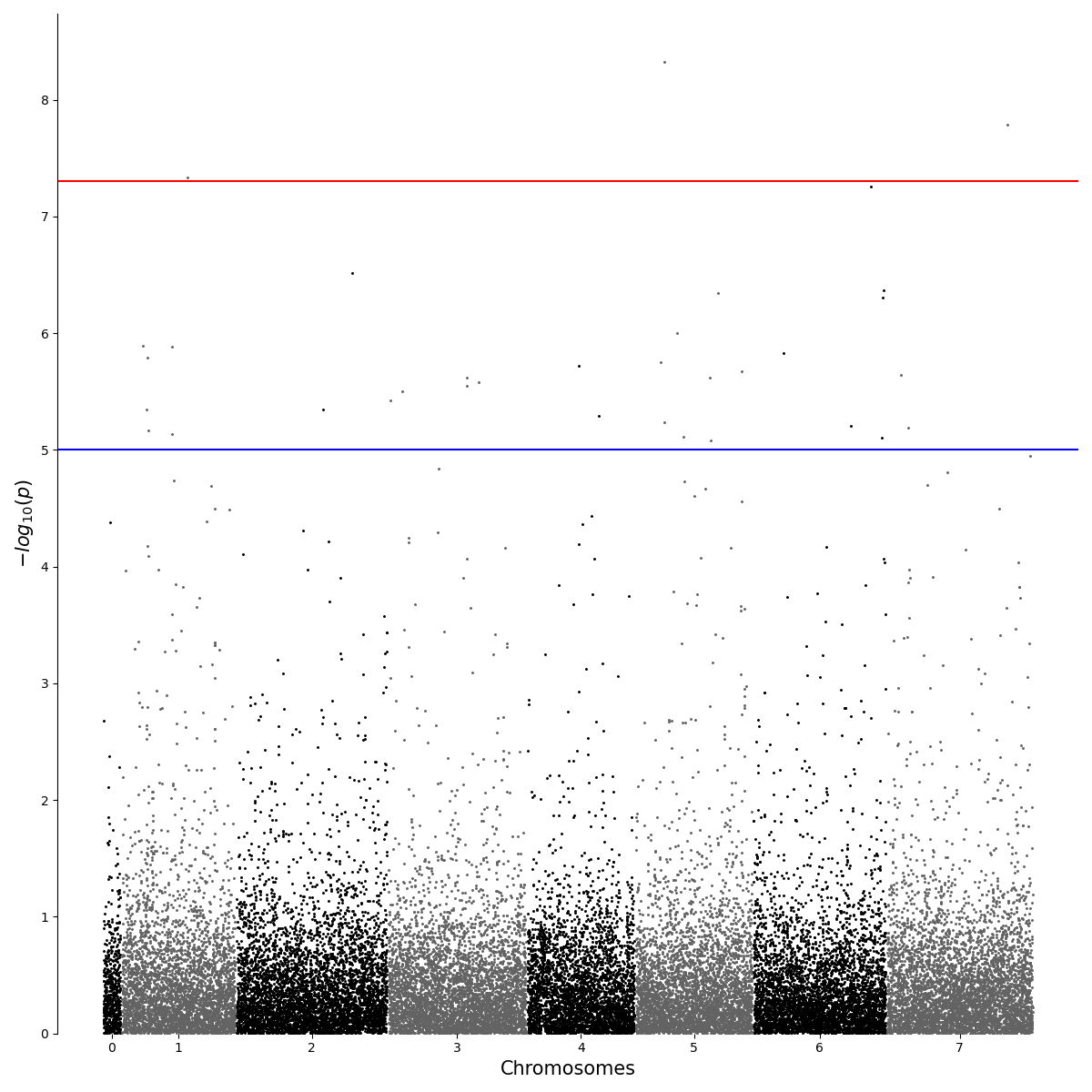
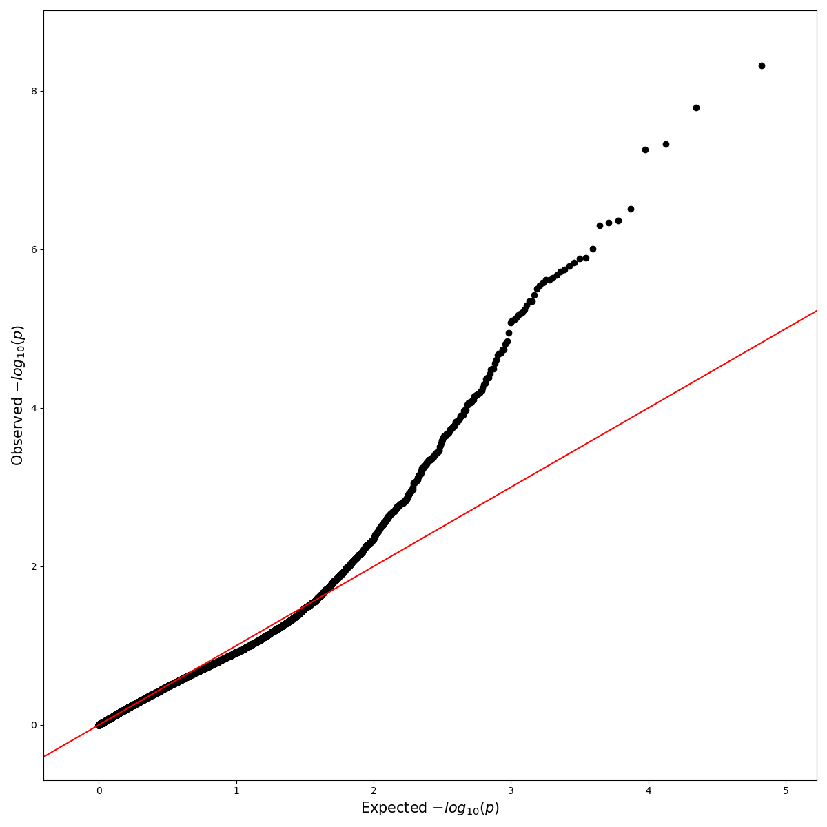
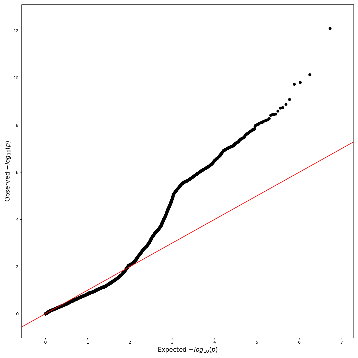
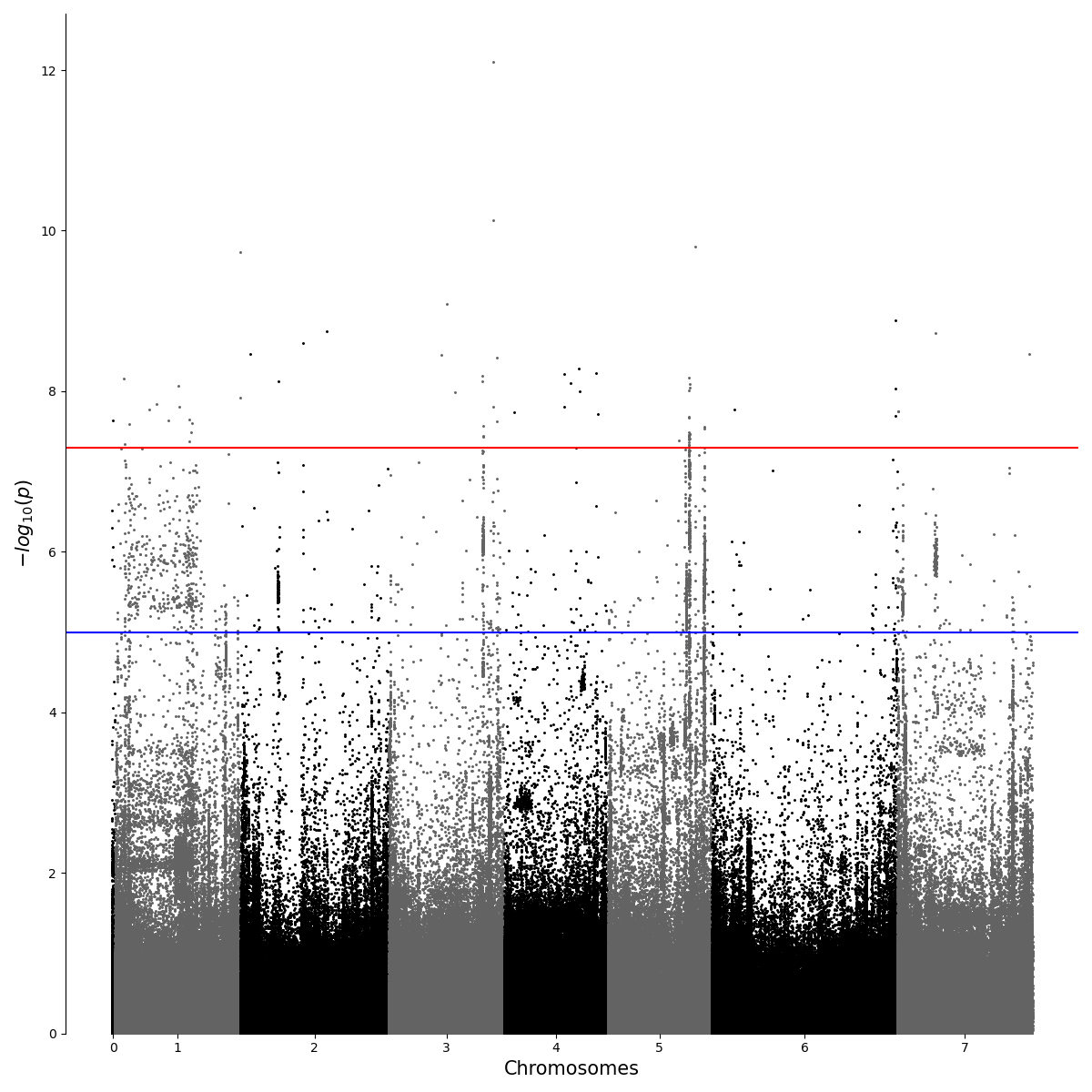
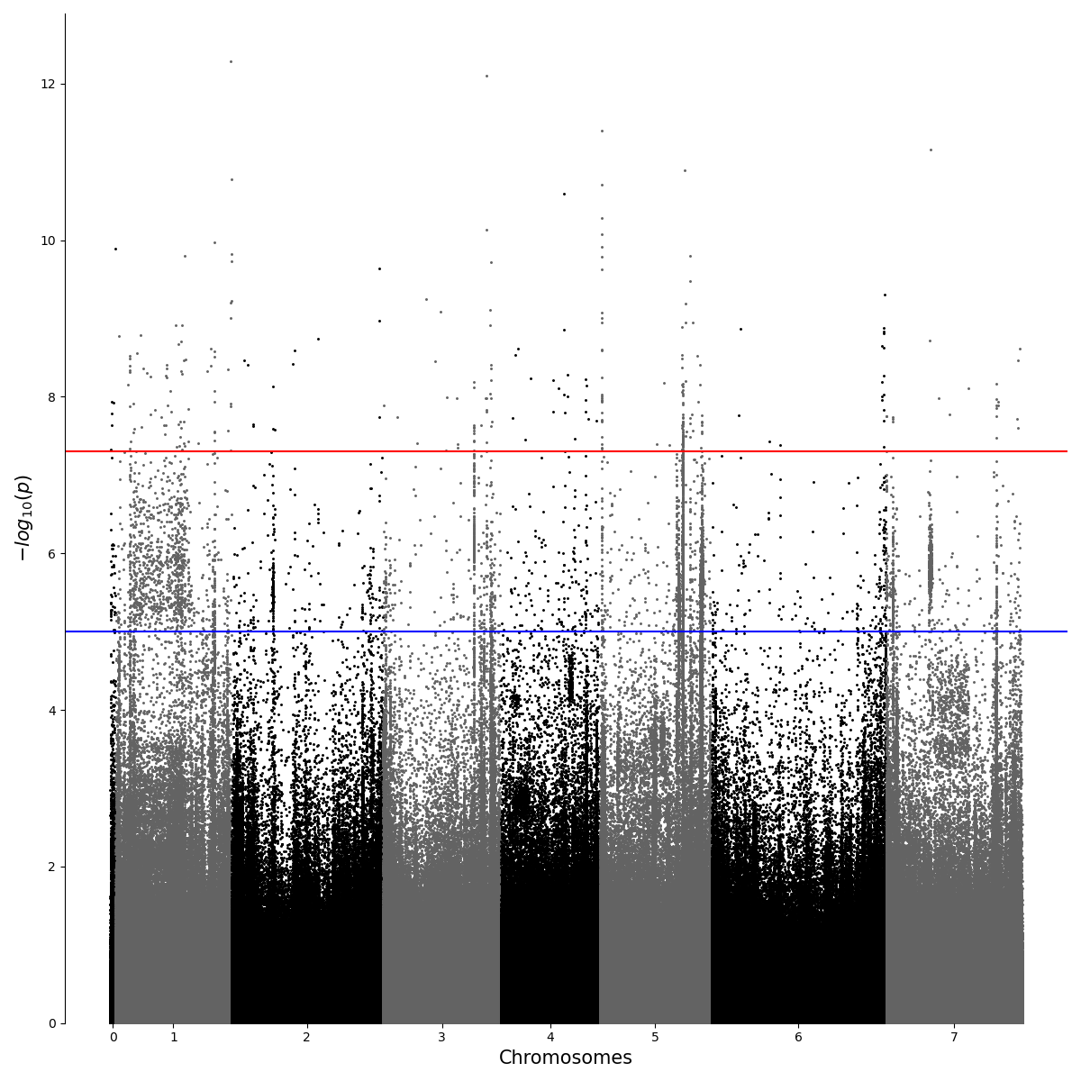
I did a bunch of GWAS analysis (linear model without covariates) with applying different quality controls. How to choose the optimal settings when filtering for minor allele frequency (maf), Hardy-Weinberg equilibrium (HW) and missing call rates (mcr)? Are there any rules? Here are some examples:

Mahnhatten and QQ plot with settings maf=0.02, HW=1e-10, mcr = 0.2:

maf=0.02, HW=1e-10, missing call = 0.2

enter image description here

Manhattan and QQ plot with settings maf=0.01, HW=0.0001, mcr = 0.01:

enter image description here

enter image description here

Mahnhatten and QQ plot with settings maf=0.02, HW=1e-10, mcr = 0.05: enter image description here

enter image description here

enter image description here

$\endgroup$
1
  • 1
    $\begingroup$ I don't think there is a principled way of choosing such cutoffs. The first and last set of filters look much better than the second set. $\endgroup$
    – winni2k
    Commented Sep 19, 2020 at 15:59

2 Answers 2

0
$\begingroup$

The genomes under analysis are under predominant linkage disequilibrium, i.e. linkage. Chromosome 1 shows strong (or stronger - cut-off depending) HW signal as do one or two telomeres - telomeres are known to undergo recombination, so this may not be unsurprising. Nothing wrong with the HW analysis for the core conclusions, its the stuff between the red and blue lines thats difficult (Q-Q plots).

The Q-Q plots are a bit more complex and I would go with the lower graph you presented together with its HW-analysis. There is clearly part of the data you are not accounting for, @gringer says the Q-Q plot conform to the beta distribution .... they should be bang linear. Lets look in more detail,

  • 0 to 2 ... predominant disequilibrium that looks fine, nice and linear
  • 5.5+ .... HW signal that looks ok, nice and linear
  • 2 to 5.5 ... complicated

Given you have a cut-off (red line) at around 5.5 then I'd sort of try and talk your way out of this one. You can do a full investigation, such as transformation to linearise the entire Q-Q plot. Personally I've never done this within HW analysis so I dunno, I've done it for GLM. I'd just say they between the blue and red line represents a complex HW signal which we can't be interpreted but either side of that boundary we're good to go. In other words keep it simple.

$\endgroup$
11
  • $\begingroup$ "gringer says the Q-Q plot conform to the beta distribution" - no, I didn't say this. The p-values should conform to the linear distribution if the association is not omnigenic, but the test statistic [which is not a p-value] will not fit a linear distribution. Most GWAS programs produce beta values as their association statistic, which is why I mentioned beta. $\endgroup$
    – gringer
    Commented Sep 20, 2020 at 23:59
  • $\begingroup$ Thanks Michael for your opinion. I am coming from the ML field were evaluation of a model with training data is more clear to me. I found it very hard to estimate GWAS filtered by "feeling" and looking at plots (also because I want to do it automatically). I am new to GWAS and all I need is a simple GWAS. I was unsure about using PCA or LMM or I could go for a simple linear analysis and whether this looks kind of "normal".Thanks for your feedback. $\endgroup$
    – snowflake
    Commented Sep 21, 2020 at 6:53
  • 1
    $\begingroup$ Welcome to 'traditional' statistics @snowflake ... Q-Q is seen as a general approach. If it is approximately linear you good to go. In this instance that isn't quite the case. HW has meaning here (biological meaning). PCA doesn't have much meaning, its okay for data-mining, whilst GLM or GLMM is the sort of analysis where transformation is used to linearise a Q-Q. Peronally I'd stick with what you have and look at the biologial understanding. Just my opinion. $\endgroup$
    – M__
    Commented Sep 21, 2020 at 13:58
  • 1
    $\begingroup$ Hi @snowflake keep in mind the central rule of ML is that ANY equation can be replicated in ML, particularly deep learning. I'm not sure a population genecist will agree :-) but thats the theory. So you could use the classification to train an ML model and ditch the 'traditional approach' in future. $\endgroup$
    – M__
    Commented Sep 21, 2020 at 16:05
  • 1
    $\begingroup$ @snowflake okay I see, personally I think your HW results are fine given the caveats. However, if population genomic structure through HW isn't your thing (I would say it is a clear biological model) then first I'd do PCA and then depending on your purpose assess the populations e.g. via Fst. Personally I would just do a phylogenetic tree given these are SNPs. From a phylogenetics point of view the problem with PCA is that it is biologically difficult to interpret why the populations or different regions of the genome are separating. The thing which supercedes this dogma is ML partic. DNN $\endgroup$
    – M__
    Commented Sep 22, 2020 at 12:05
2
$\begingroup$

Based on the QQ plots, filter out variants with p > 0.01, then display the beta statistic (or whatever other statistic you're using to demonstrate association). If you want to incorporate the p-value in the displayed results, show the minimum test statistic from a 95% confidence interval. Here's an attempt I made at doing that with some GWAS summary statistics relating to household income (something that wouldn't be expected to have a heritable component):

https://twitter.com/gringene_bio/status/1207617723586371584

After looking at the test statistic, you may be able to make better decisions about thresholding with the other values. One thing you could try is to incorporate those values into a scatter plot that shows more than two dimensions. The other statistics could be represented as size, colour, or Z location on a 3D scatter plot.

P-values should not be overemphasised, used for ranking, or displayed on their own. See the American Statistical Association's report on the p-value for more information:

https://amstat.tandfonline.com/doi/full/10.1080/00031305.2016.1154108#_i30

As far as I'm aware, the p-values as calculated by GWAS software represent uncertainty in the test statistic (i.e. t, or beta), and not the probability of association. If you want to calculate that association probability, carry out bootstrap sub-sampling of the individuals and then determine the proportion of sub-samples in which the tested variant appears in, say, the highest 5% of variants, ranked by the test statistic. Instead of filtering on HWE, MAF and MCR, you could try filtering on the bootstrap proportion instead, which should incorporate all statistics that introduce uncertainty into the dataset.

More details and figures can be found on this poster:

https://f1000research.com/posters/5-2190

If you're going to be generating a PCA on these data, please consider labelling the cases and controls (or low/high for quantitative traits) on the PCA to verify that the groups look similar in terms of overall population structure. Hopefully you won't find any blobs in the PCA that have only one of the two groups in them, but if you do, they should be dealt with first. Any differences in population structure (even very small, subtle differences) will dominate the GWAS results because structure-associated signal will cover a huge region of the genome in comparison to effects from a few (or a few hundred) SNPs. Here are some papers I've found insightful regarding this issue:
$\endgroup$
1
  • $\begingroup$ Thanks a lot for this detailed explanation, I will have a look on the beta statistics as well. plink is reporting beta and std, you are right. $\endgroup$
    – snowflake
    Commented Sep 21, 2020 at 6:49

Your Answer

By clicking “Post Your Answer”, you agree to our terms of service and acknowledge you have read our privacy policy.

Not the answer you're looking for? Browse other questions tagged or ask your own question.