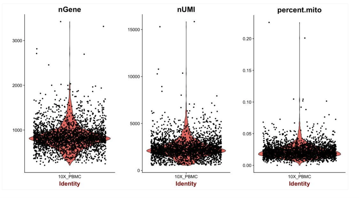
I'm confused about the meaning of the black dots and the red shape in the violin plots from the seurat tutorial:
2 Answers
The black dots represent the values for individual cells. The "nGene" plot (the first one) shows the number of detected genes for every cell.
The red shape shows the distribution of the data. For the "nGene" plot, you can see that the average number of genes per cell is about 900 and most of the cells have roughly around 700-1100 genes.
-
$\begingroup$ is it normal that you can only see the dot but not the red shape after you doing the Vlnplot? My data shows that problem after I doing the gene in cluster, so I was confuse whether it is a problem or not? $\endgroup$– huaCommented Aug 25, 2018 at 21:14
-
$\begingroup$ If you see just a dot, it probably means you have one outlier. If you look closely, you will probably notice the rest of the dots at 0 (so they look like a line). $\endgroup$– burgerCommented Sep 9, 2018 at 23:42
The plot includes the data points that were used to generate it, with jitter on the x axis so that you can see them better. In red you see the actual violin plot, a vertical (symmetrical) plot of the distribution/density of the black data points.
